STOP SEARCHING. START CREATING.
Have you ever spent more time hunting for the "perfect" shade and texture of paper than actually crafting?
I believe that your creative flow shouldn't be interrupted by mismatched tones and patterns or the frustration of digital colors that look different once printed.
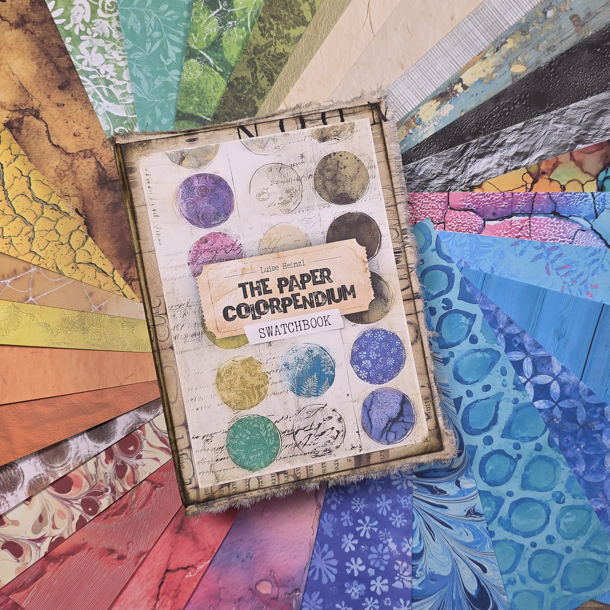
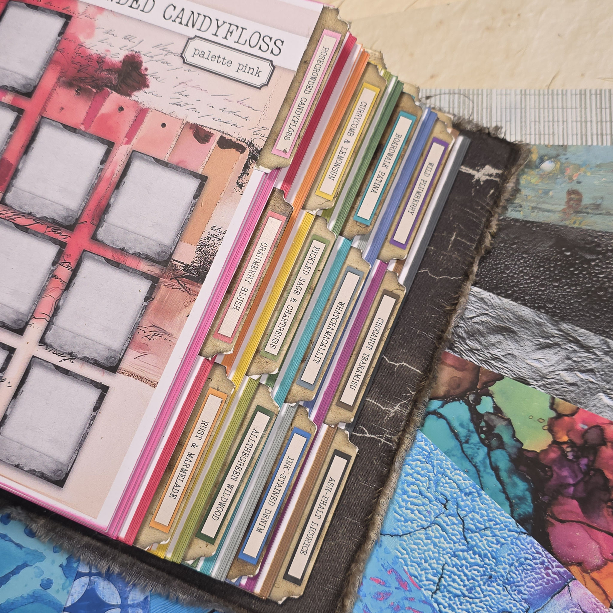
THE PAPER COLORPENDIUM is more than just a digital paper collection - it is a curated system designed to bring effortless harmony to your projects and keep both your digital and physical paper stash organized.
It is fully customizable to your unique needs; you can even integrate swatches of your favorite mediums and materials to create a cohesive workspace.
Whether you are building a junk journal, making cards, layering delicate ephemera, or searching for that special hue, this collection provides the foundation you’ve been looking for.







WHAT'S INSIDE?
I’ve designed this collection of 1,200 papers to be as practical and versatile as possible, so you can spend less time worrying about technicalities and more time creating. Here is what you’ll find:
- 12 COLOR PALETTES: A thoughtful selection of color worlds that I’ve put together to ensure your projects always feel balanced and harmonious.
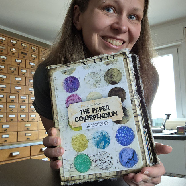
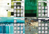
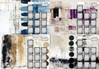
- THE SWATCHBOOK [IT'S FOR FREE!]: I really wanted you to have this tool, so I’m including it as a gift. It’s a simple, effective way to print your own physical reference guide and see how the colors look on your specific paper and printer.
- Ready-to-Print Formats: To make things easy, every design comes in both A4 and US Letter. No matter where you are or what printer you use, it’s ready to go.
- ONGOING INSPIRATION: I’ll be sharing videos throughout the entire year on my YouTube channel, filled with ideas, tutorials, and fresh inspiration on how to use these palettes in your projects.
Feel free to click on each palette to explore its unique world of color - dive into the details and find the perfect shades to bring your next project to life!
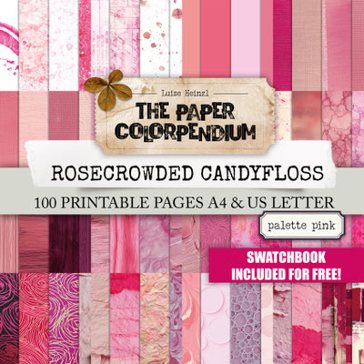

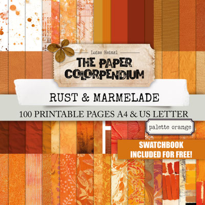


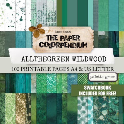


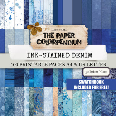
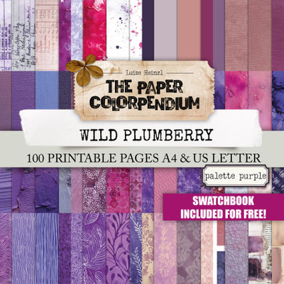
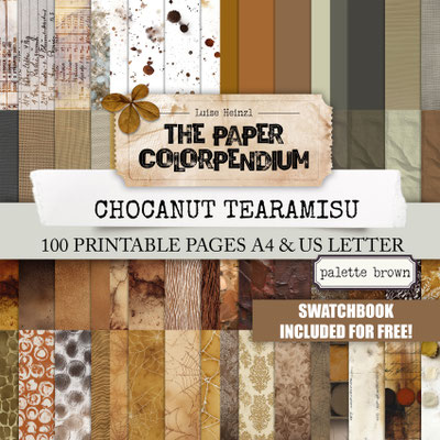

Want the full spectrum at your fingertips all year long? Choosing the complete bundle not only keeps your creative momentum flowing but also gives you the best value, ensuring you have every single hue ready whenever inspiration strikes. Please click the picture for more details.

WHY YOU'LL LOVE IT.
THE PAPER COLORPENDIUM removes the guesswork. No more wasted ink, no more clashing undertones, and no more "decision fatigue." By having a physical SWATCHBOOK at your fingertips, you can match your materials like ephemera, fabrics, laces, die cuts and stamp impressions to your paper with 100% confidence.
Give yourself the gift of a coordinated workspace. Explore the palettes, print your swatches, and experience how much more joyful crafting becomes when the colors simply click.
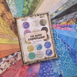
THE PAPER COLORPENDIUM
SWATCHBOOK
To make your creative process even smoother, I’ve included a free printable SWATCHBOOK with your collection. Yes, you've heard right, it's for free.
Think of it as your personal color library- a practical guide that bridges the gap between your screen, your stash, and your desk.
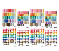
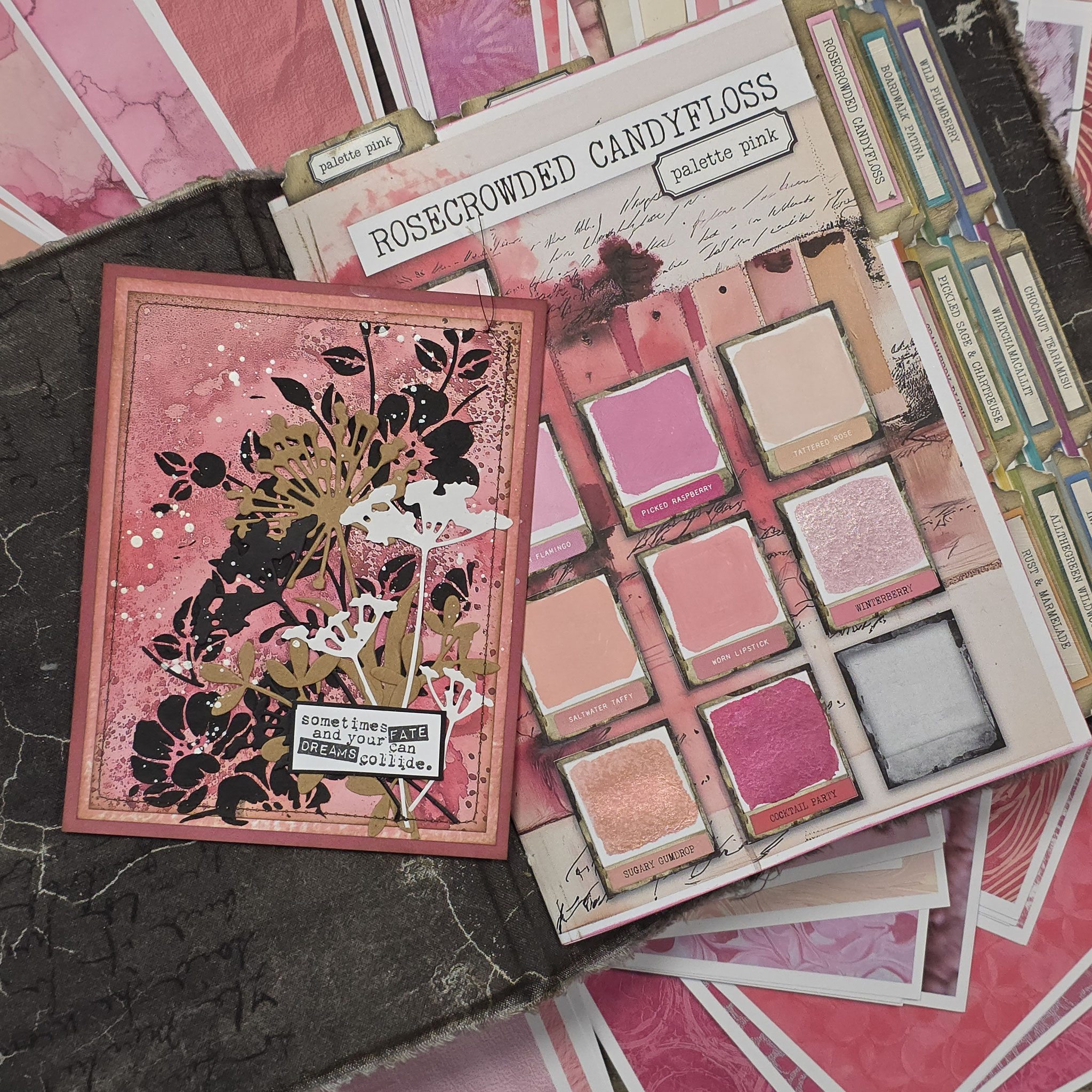
- THE ULTIMATE OVERVIEW: It contains all 1,200 swatches, neatly organized by color palette. No more guessing how a color will look once printed; you’ll have the physical proof right in front of you.
- ECO-FRIENDLY & EFFICIENT: You don’t need to print all 1,200 full-sized papers! Each swatch is clearly labeled with its specific file name, so you can flip through your book, find the perfect match, and print only the exact sheet you need.
- BEYOND JUST PAPER: This book is designed to grow with you - you can swatch any medium you own. From watercolors and markers to inks, sprays and acrylics, you can see how your tools interact with your favorite papers.
- FULLY CUSTOMIZABLE: Whether you want to add scraps of your physical paper stash, lace samples, or other digital paper collections and ephemera, you can organize and expand the book to fit your unique needs.
This isn’t just a list of colors; it’s a living tool designed to sit right on your desk, helping you make confident creative choices every single day.
[Yes, it’s actually free. No catch, no hidden fees. Just a gift from my craft desk to yours. Click, download, and get organized!]
SWATCHBOOK FREEBIE ADD-ONS
The Paper Colorpendium is constantly growing with your amazing feedback! To make the system even more useful for your daily crafting, I’ve created these free add-ons for your Swatchbook - download them below and enjoy!



Ready to build your new favorite tool? Since the SWATCHBOOK sadly doesn't assemble itself in the printer (believe me, I tried!), I’ve created this step-by-step guide for you. Don't worry - it’s easier than it looks, and by the end of this video, you’ll have a professional color library right on your desk!
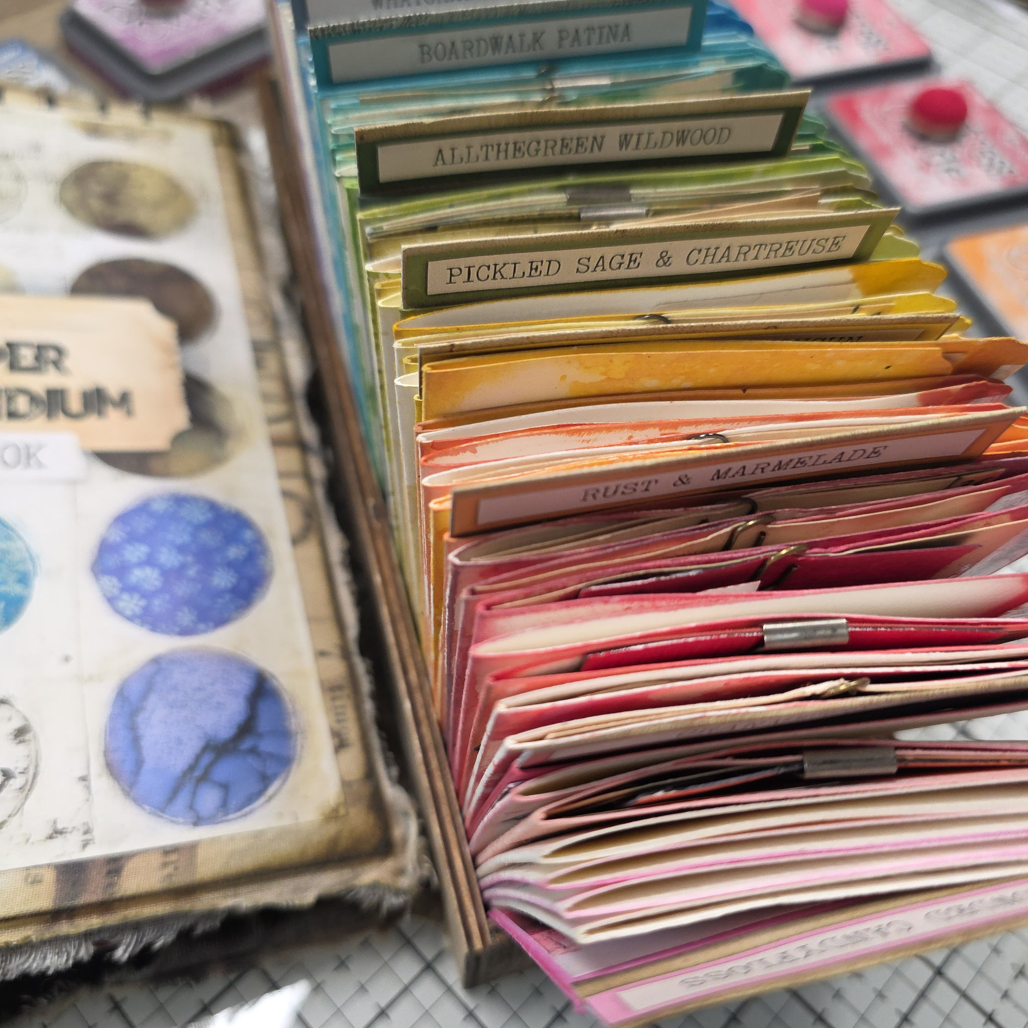
Make it fancy 😊 We're adding the page tabs to our PAPER COLORPENDIUM SWATCHBOOK.
This is the final step to turning your swatchbook into an organized library for all the things in your craft room, not only digital paper! These tabs won’t just make your book look beautiful; they are the key to finding any color or material in seconds. No more flipping through pages – just pure creative flow!
In this second part of the assembly tutorial, I’ll show you exactly how to attach the tabs so your system stays organized. Remember, this book is designed to grow with you. Use it for the 1200 papers in the collection, but also for your inks, paints, fabrics etc!
YOUR PRINTING GUIDE:
HOW TO BRING YOU PAPER COLORPENDIUM SWATCHBOOK TO LIFE!
Everything you need for your SWATCHBOOK is waiting for you in your download folder. To ensure your physical guide looks as beautiful as the digital version, here are my top tips for a perfect print:
1. THE PAPER CHOICE
For my own SWATCHBOOK, I used 200g matte photo paper. I chose a slightly heavier weight than what I usually use for junk journals to give the pages extra stability - especially since you’ll be customizing them with your own mediums. This weight ensures the colors are vibrant and the swatches feel like what you'll have on your projects later.
Here's a link to the paper I used: https://amzn.to/4pC7Izb
2. PRINTING THE SIGNATURES
The SWATCHBOOK is designed in signatures like you know it from making a junk journal. Please print these double-sided in the order they appear in the PDF.
Automatic: If your printer supports duplex printing, just select that in the settings and you’re good to go.
Manual: If your printer doesn't do this automatically, print the odd-numbered pages (fronts) first, then flip the paper and print the even-numbered pages (backs).
3. PRINTING THE EPHEMERA
The files named "ephemera" are meant to print one-sided. I've used the same 200g matte photo paper for those.
4. SIZING & BORDERS
The printable is natively sized for DIN A4. You can print it borderless if your printer supports it, or with a small white margin. In my assembly video, I explain why I personally prefer printing with a margin!
5. PRINTING ON US LETTER [WITHOUT LOOSING DETAIL]
- For my Heinzl Crew members using US Letter paper, don't worry! You can easily print the files without cutting off any important parts of the design. Here is how:
- Select "Fit to Page" or "Scale to Fit": In your print settings, ensure this option is checked. Because US Letter is slightly shorter and wider than A4, your printer software will automatically adjust the image to fit the page.
- Centered Alignment: Make sure the "Center Image" option is selected. This creates a slightly larger uniform margin on the top and bottom, but it ensures that 100% of the swatch information remains visible and nothing is cropped.
- Quality Check: Always do a "Print Preview" before hitting start. If you see the entire design within the red or dashed lines of your printer's preview, you are all set!
Need help? Please just message me!

A YEAR OF COLOR: OUR CREATIVE JOURNEY TOGETHER
One of my favorite things about the PAPER COLORPENDIUM is that it’s not just a product, but a year-long inspiration journey. To help you dive deep into each color world, I’ve dedicated a specific palette to every month of the year.
On my YouTube channel, we will explore these colors together through tutorials, project ideas, and fresh inspiration. This way, you’ll never face a "blank page" alone. Here is our roadmap for the year:
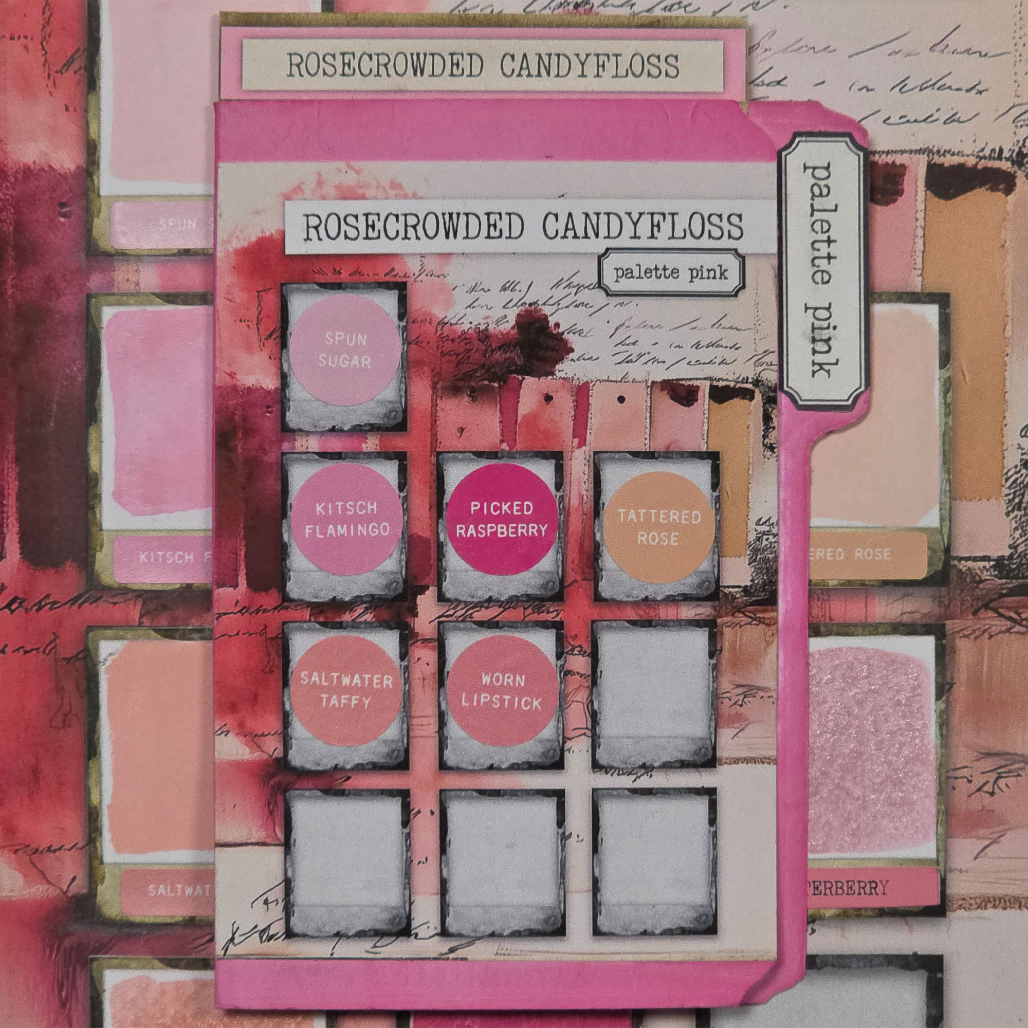
JANUARY: ROSECROWDED CANDYFLOSS - PALETTE PINK
An entire garden of the sweetest pinks. Explore a spectrum that wanders from the palest, airy blush of cotton candy to the deep, crowded tones of a rose thicket in full bloom. It’s a delicate yet powerful collection of tints that bring a romantic, layered glow to your projects.
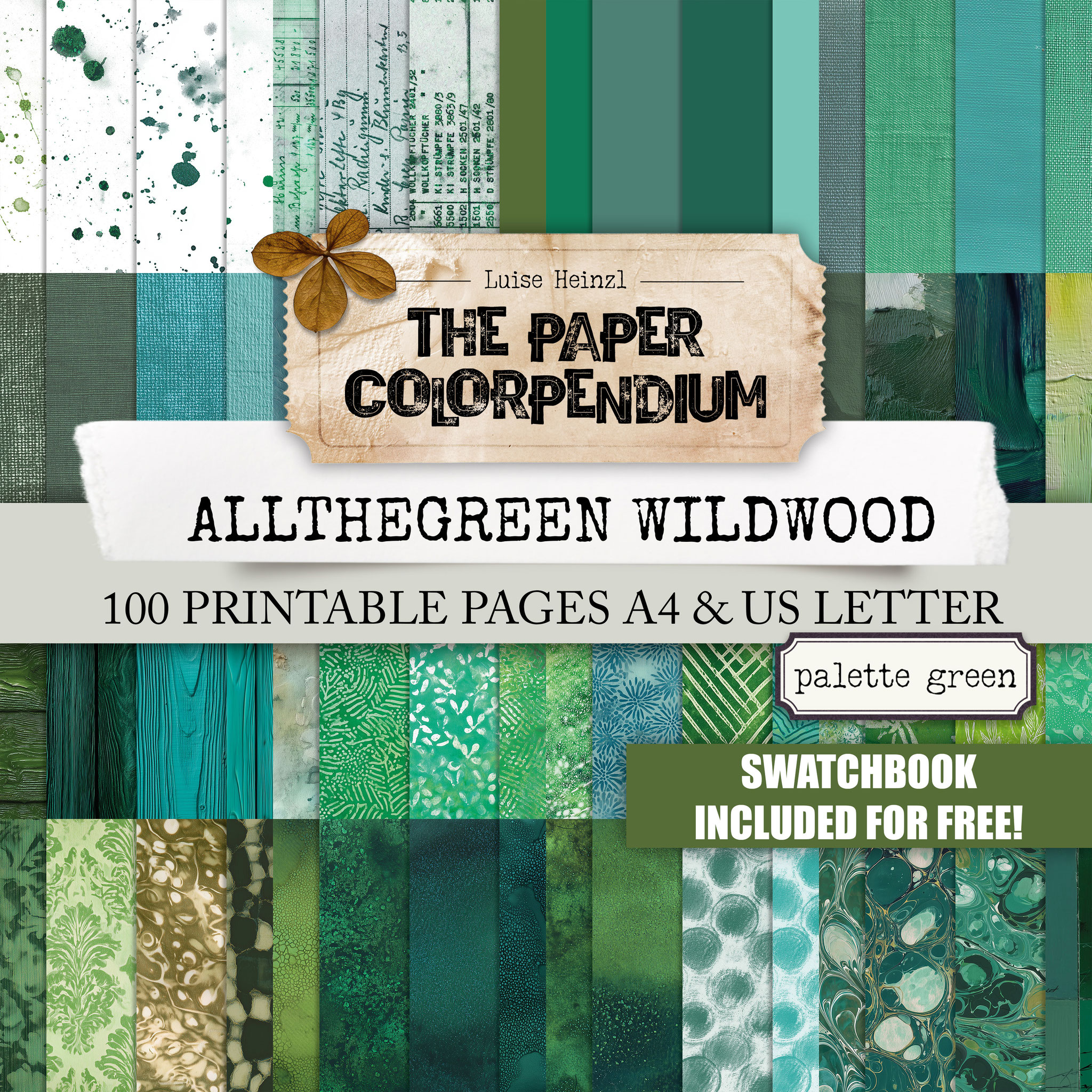
FEBRUARY: ALLTHEGREEN WILDWOOD - PALETTE GREEN
This is the sanctuary of all the "true" greens. This palette celebrates the pure, vibrant heart of the forest. Explore a rich spectrum that ranges from the fresh, crisp bite of a spring leaf to the deep, majestic emerald of a hidden woodland. It is a collection of honest, botanical greens designed to provide a lush, timeless foundation for your projects - pure and unapologetically green.
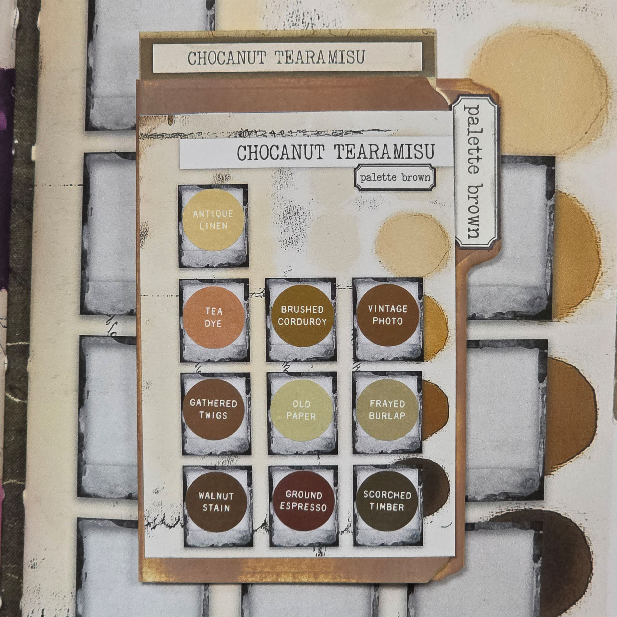
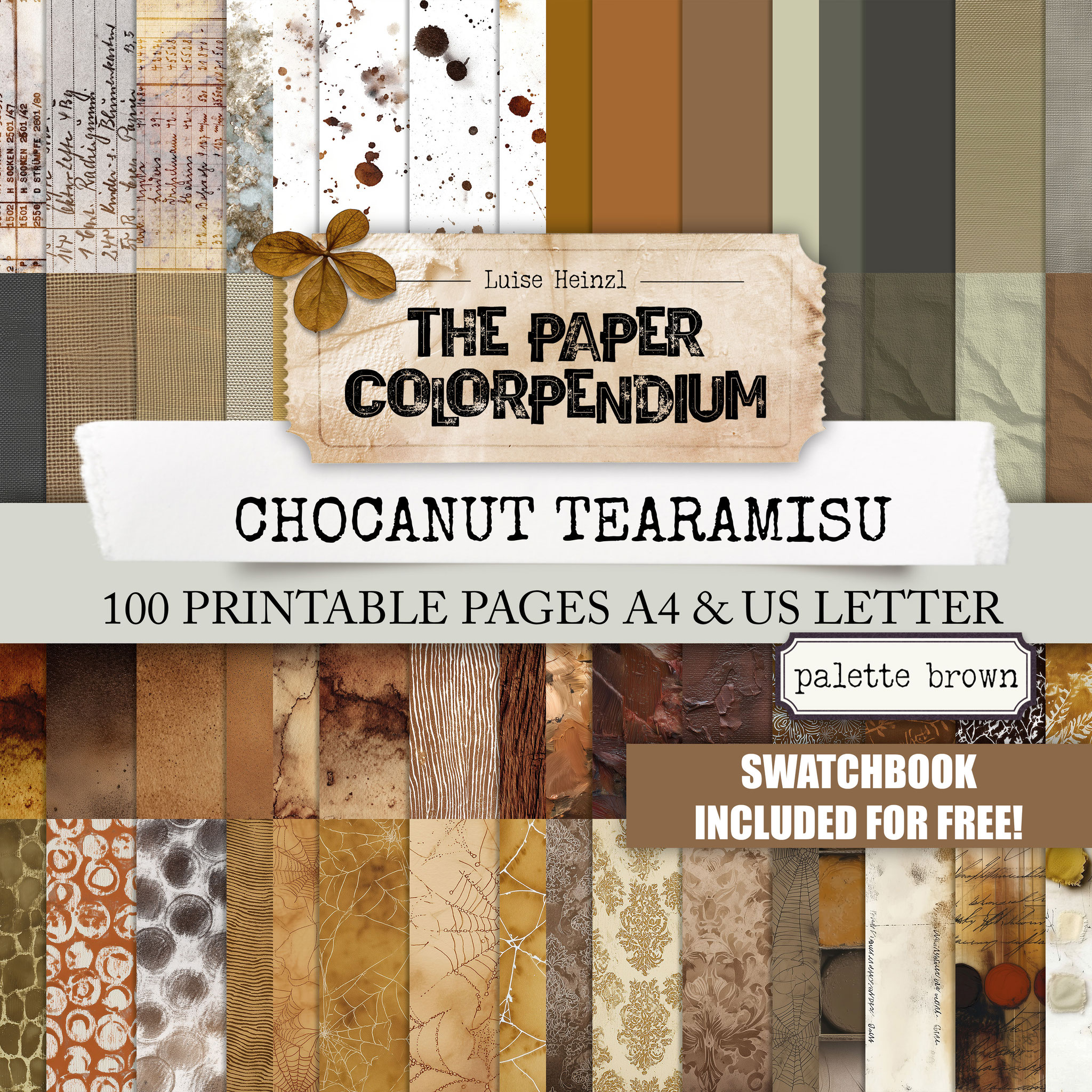
MARCH: CHOCANUT TEARAMISU - PALETTE BROWN
A day in a sun-drenched Italian café: Dive into a decadent spectrum of browns that looks good enough to eat: from the golden drizzle of warm caramel to the crunch of hazelnut brittle and the rich, dark intensity of melting chocolate sauce dripping over a perfect Tiramisu. Whether you prefer a light, biscuity latte or a deep, velvety cocoa dusted with extra spice, these shades bring a delicious, indulgent warmth to your desk. It’s a feast for the eyes and the soul - no calories, just pure creative bliss.
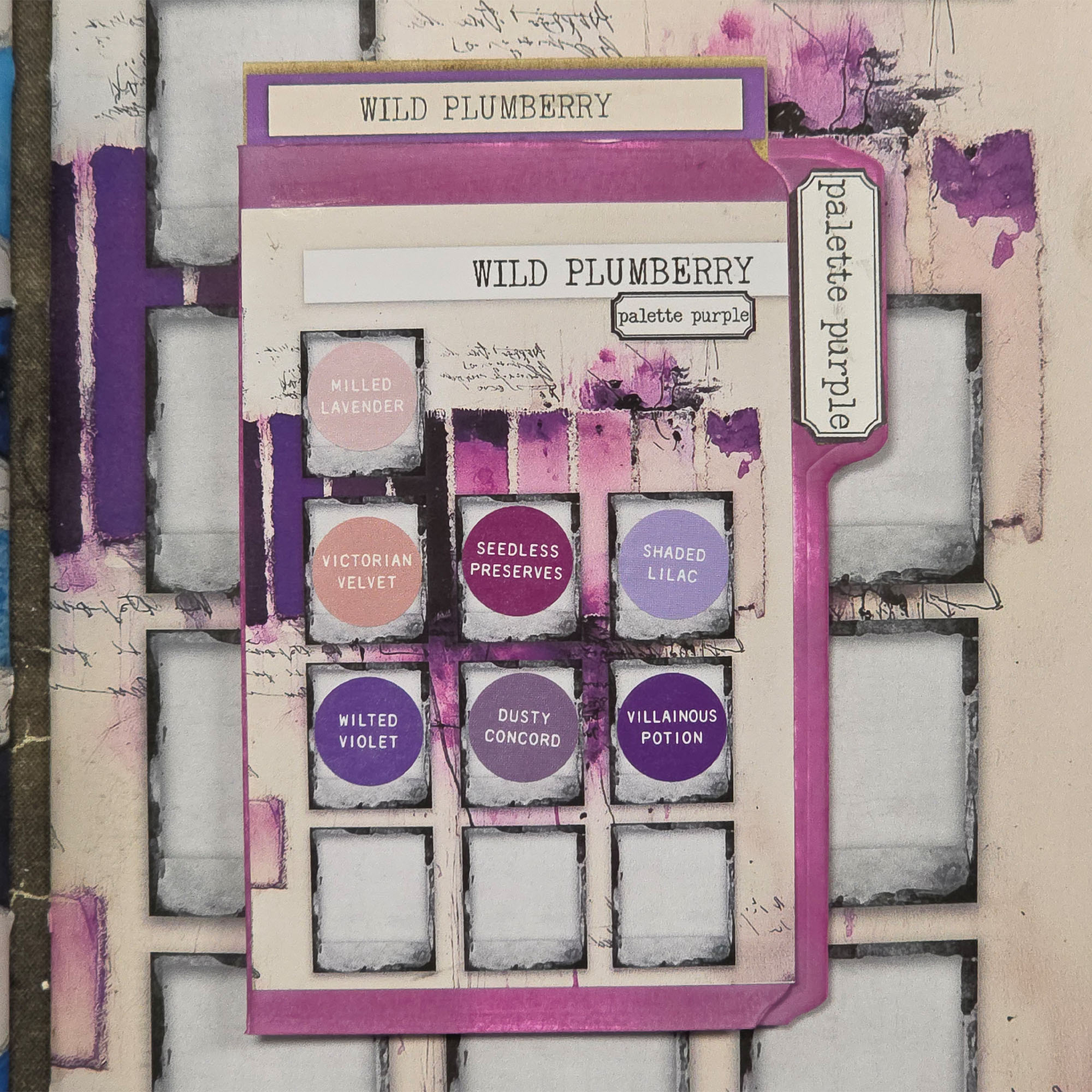
APRIL: WILD PLUMBERRY - PALETTE PURPLE
A juicy harvest of violet and plum. This collection offers a breathtaking range of purples - starting with soft, dusty lavender and reaching deep into the saturated, tart tones of crushed wild berries. It’s a moody, regal spectrum that adds instant drama and elegance.
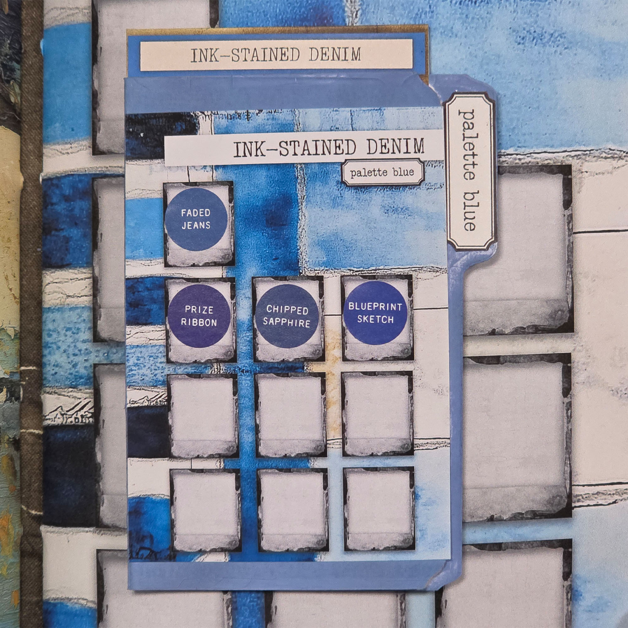
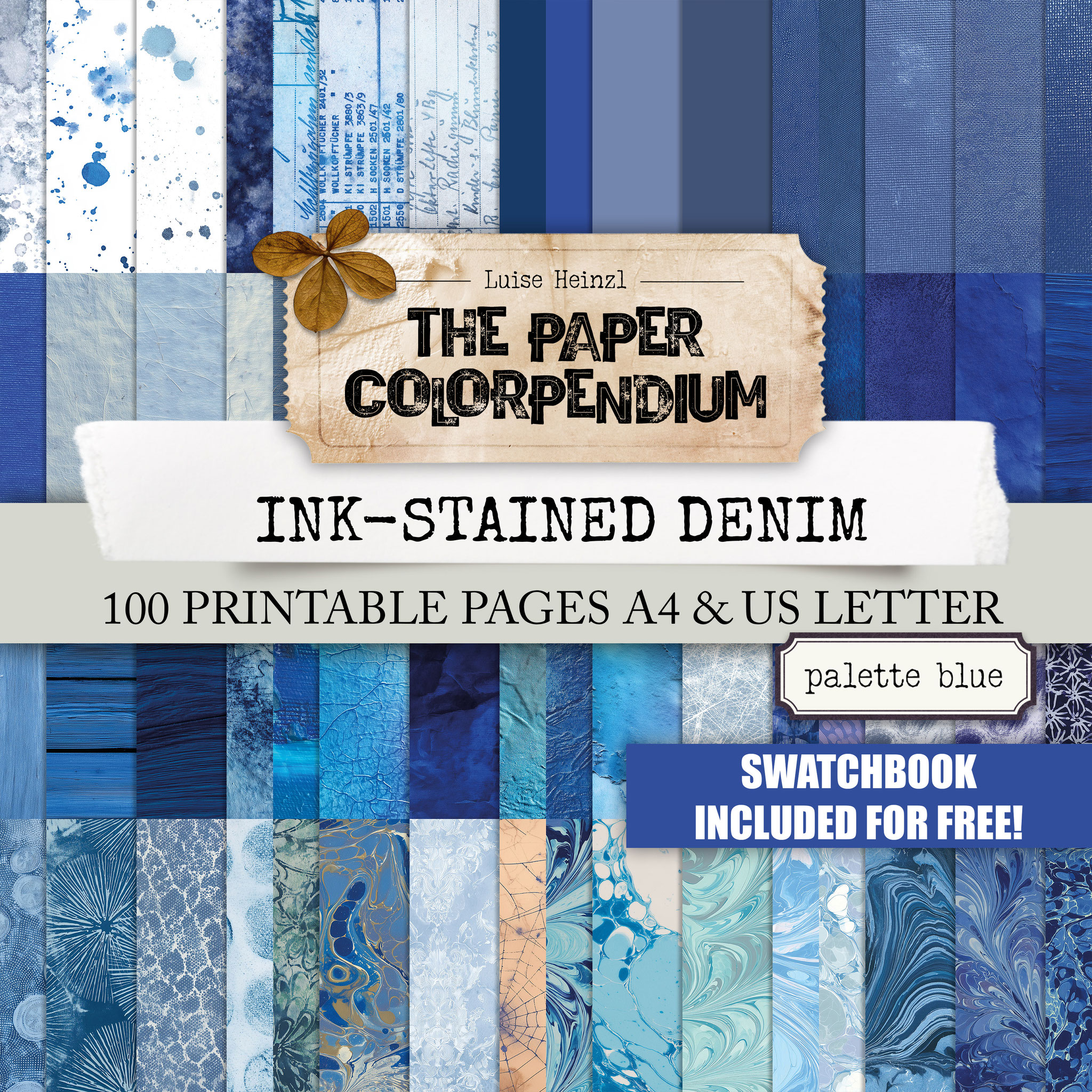
MAI: INK- STAINED DENIM - PALETTE BLUE
Every shade of a blue soul. From the faded, sun-bleached wash of vintage jeans to the intense, midnight saturation of spilled calligraphy ink. This palette gives you a complete library of blues that feel both nostalgic and profoundly deep.
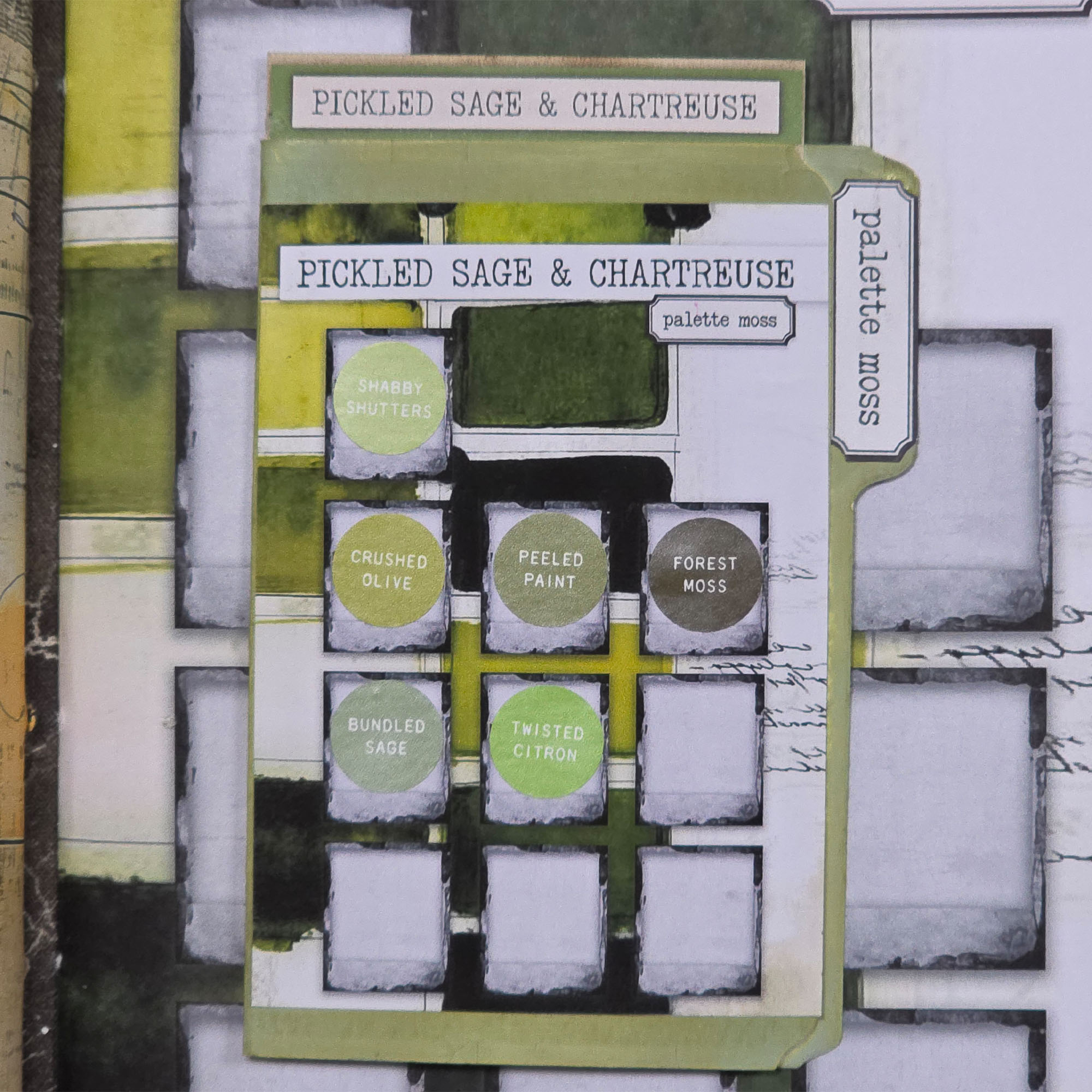
JUNE: PICKLED SAGE & CHARTREUSE - PALETTE MOSS
A vibrant dance between earth and light. This palette spans the quiet, muted tones of dried herbs and pickles to the electric, zesty glow of fresh chartreuse. It’s an adventurous mix of yellow greens and green yellows that adds a "zing" - not only to your summer projects.
JULY: CURRYCOMB & LEMONSUN - PALETTE YELLOW
A radiant explosion of golden light. Discover a world of yellows that moves from the soft, pale flicker of early morning sun to the spicy, heated depth of dry curry and mustard. It’s an energetic spectrum designed to drench your work in warmth.
AUGUST: BOARDWALK PATINA - PALETTE TURQUOISE
The colors of the coast, captured in every tint. This palette ranges from the softest sea-foam to the rich, weathered oxidized copper found on an old pier. It’s a refreshing, breezy collection of teals and turquoises that feels like a breath of salt air.
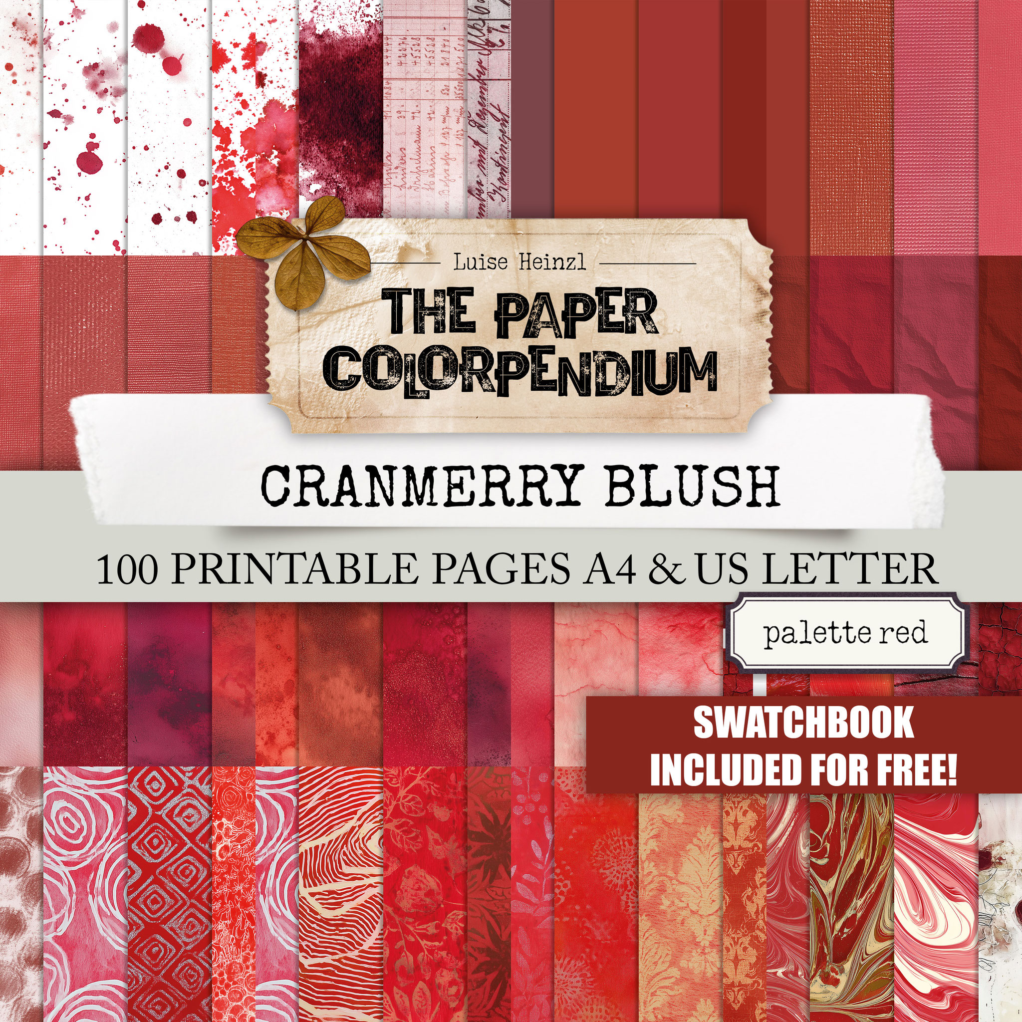
SEPTEMBER: CRANMERRY BLUSH - PALETTE RED
A sophisticated gallery of reds. From the soft, shy pinkish-red of a ripened blush to the intense, wine-dark depths of a cranberry harvest. These tones provide a regal and warm foundation that perfectly captures the changing season.
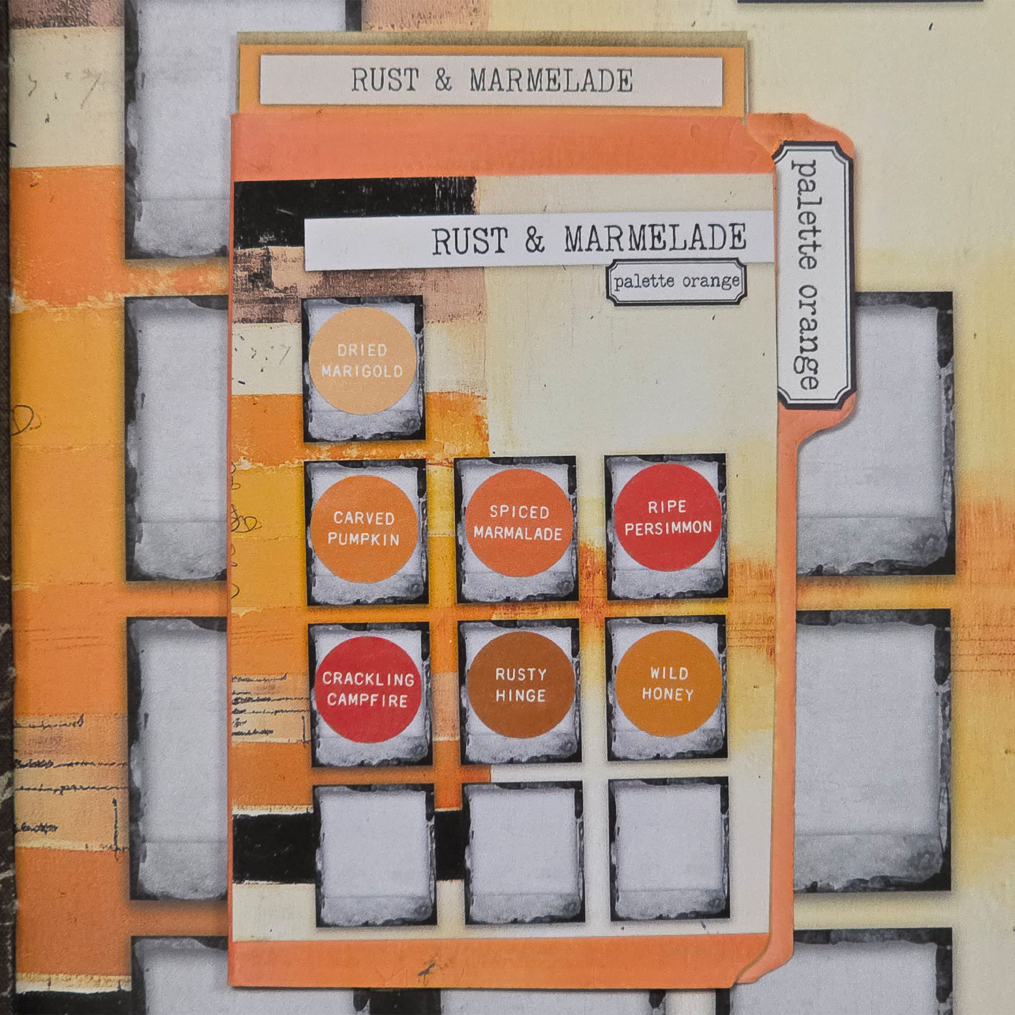
OCTOBER: RUST & MARMELADE - PALETTE ORANGE
The ultimate autumn spectrum. Dive into a collection of oranges that bridge the gap between bright, translucent citrus preserves and the deep, burnt sienna of rusted metal and fallen leaves. It’s a spicy, glowing range that radiates comfort.
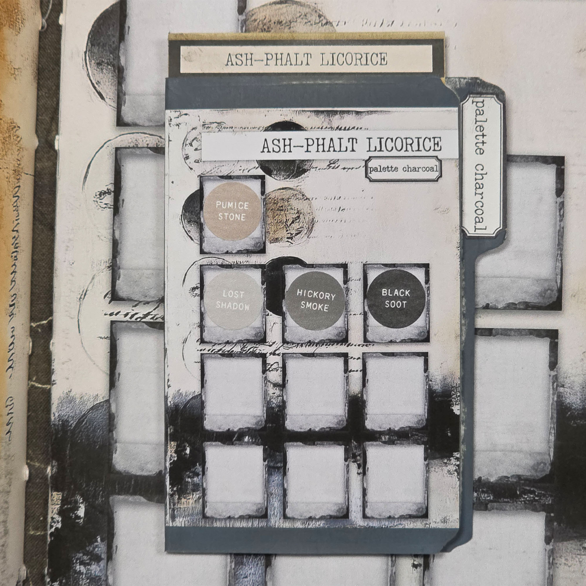
NOVEMBER: ASH-PHALT LICORICE - PALETTE CHARCOAL
The beauty of the shadows. This is a masterful collection of greys and blacks—from the soft, hazy smoke of a winter morning to the deep, matte intensity of salty licorice and rain-soaked asphalt. It provides the perfect, chic contrast for any project.
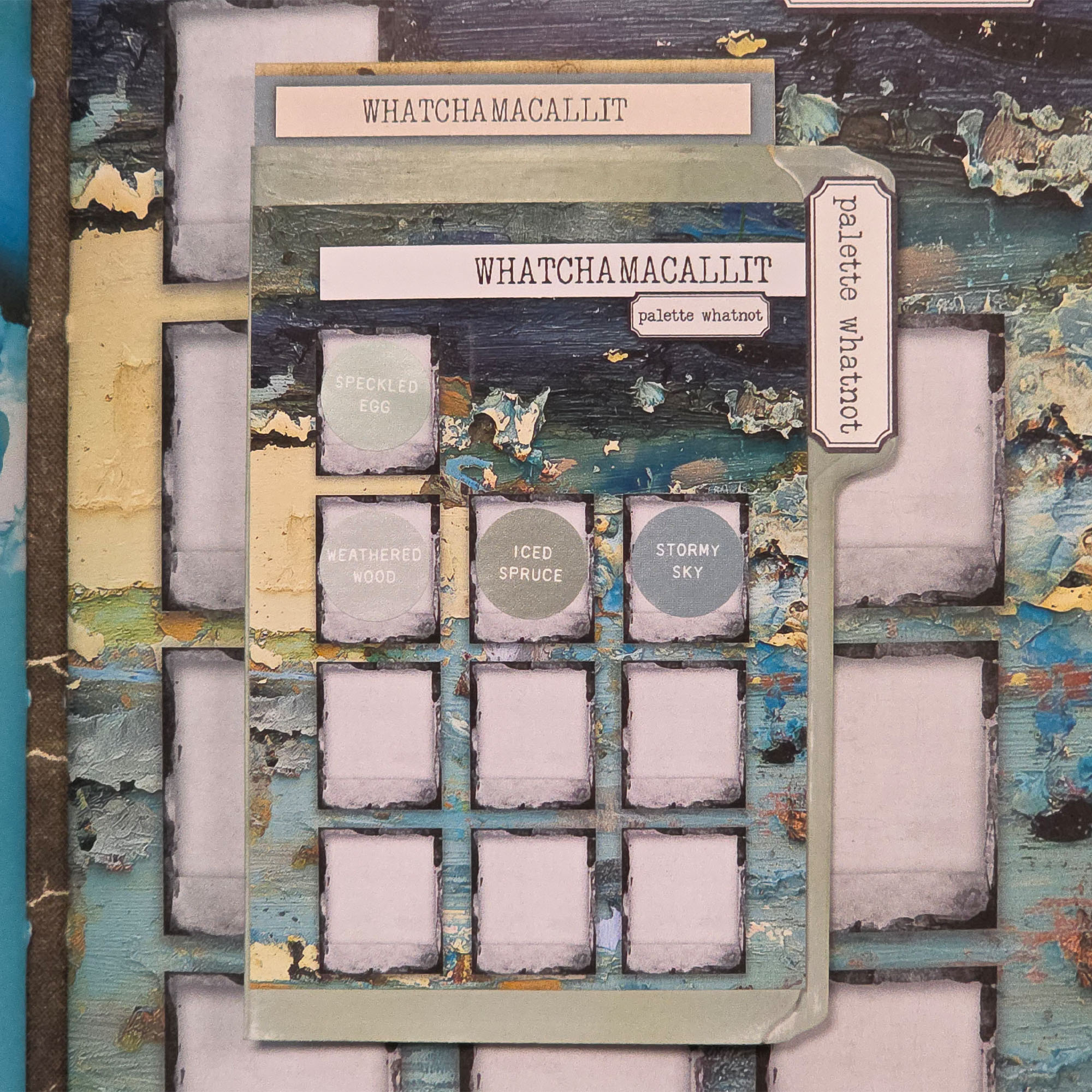
DECEMBER: WHATCHAMACALLIT - PALETTE WHATNOT
The mystery box of colors! This palette is a curated mix of those elusive, "in-between" shades that don't fit into a single box. It’s a versatile spectrum of curious tones designed to tie all your leftover scraps and ideas into one harmonious masterpiece.
That's the order we will have those color palettes throughout the year 2026. For my SWATCHBOOK I have them in this order: Rosecrowded Candyfloss, Cranmerry Blush, Rust & Marmelade, Currycomb & Lemonsun, Pickled Sage & Chartreuse, Allthegreen Wildwood, Boardwalk Patina, Whatchamacallit, Ink-Stained Denim, Wild Plumberry, Chocanut Tearamisu, Ash-Phalt Licorice.


INKING THE SIGNATURES
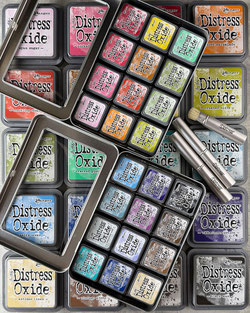
For my SWATCHBOOK I inked the edges of the signatures with distress oxide inks. Wanna use the same colors? Here's a list of the colors I've chosen:
- picked raspberry
- lumberjack plaid
- spiced marmelade
- fossilized amber
- peeled paint
- rustic wilderness
- peacock feathers
- iced spruce
- faded jeans
- seedless preserves
- gathered twigs
- black soot
STOP THE COLOR CHAOS AND START CREATING!
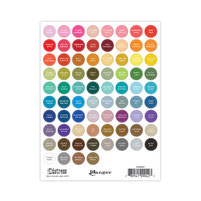
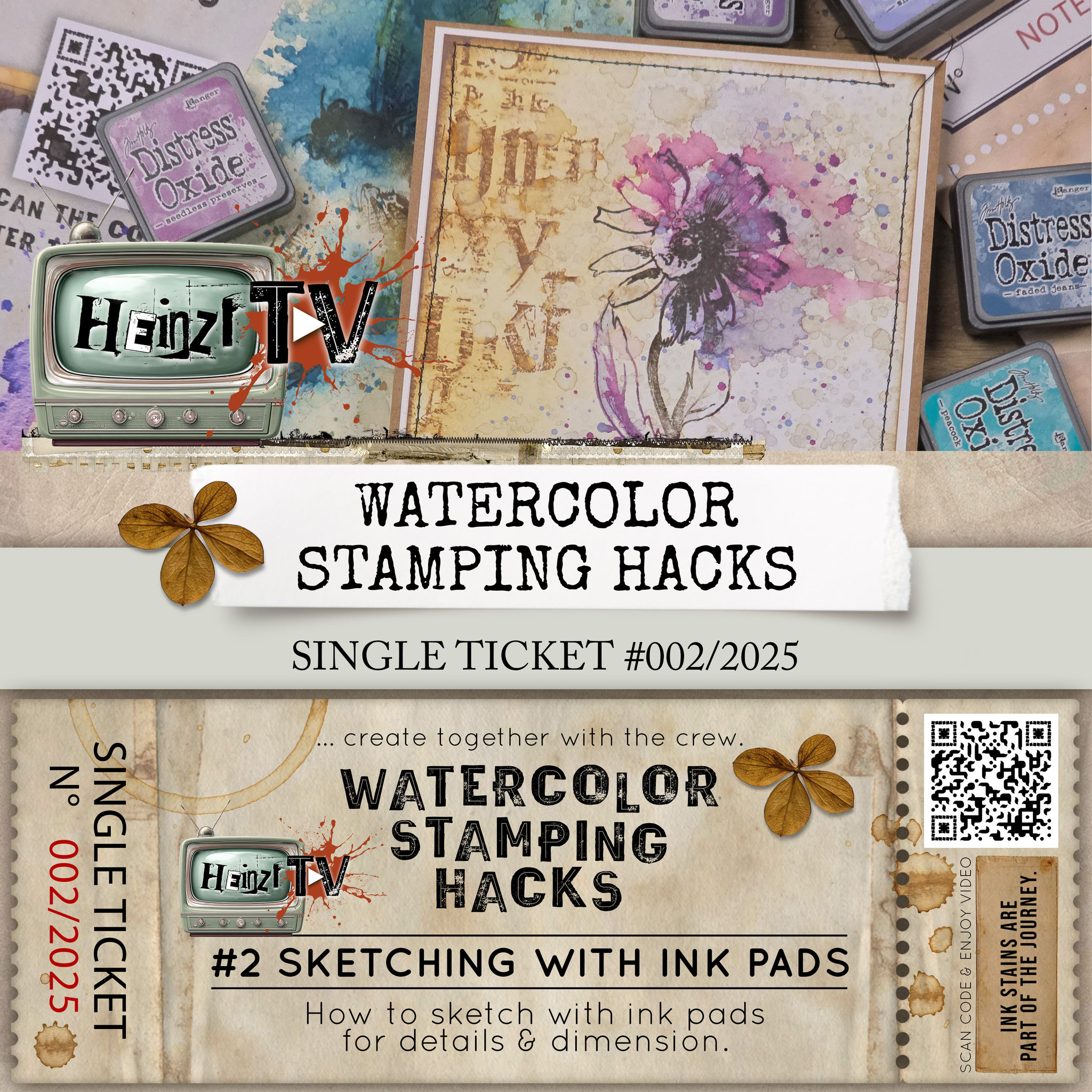
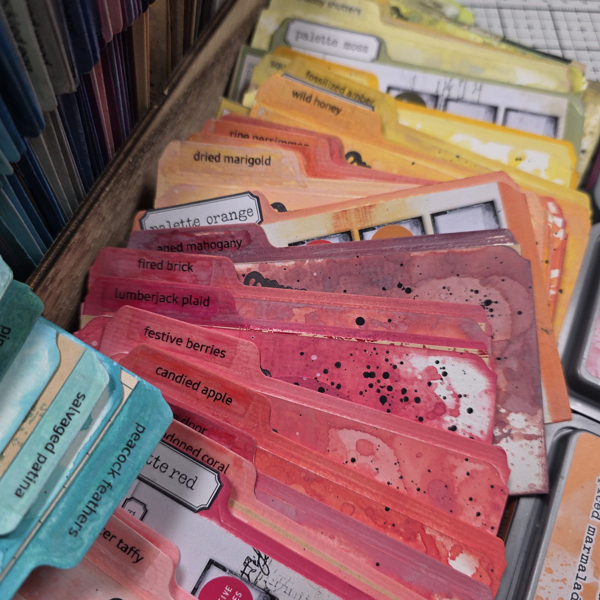
Are you struggling with keeping track of your colors? In this video, I’m showing you how I make custom dividers for my swatch box to marry the iconic Tim Holtz & Ranger color palette with my Paper Colorpendium.
The best part? The Tim Holtz & Ranger colors fit seamlessly into the Paper Colorpendium system, following the exact order Tim Holtz and Ranger intended. We’re dividing 72 individual colors into 12 clear, beautifully organized palettes. This setup gives you the ultimate overview for your junk journals and paper crafts! And pssst: This system is fully adaptable to any color palette or brand you prefer to work with.